How to Generate a Color Palette in Seconds (Free Tool)
Learn how to create harmonious color palettes instantly using a free generator. Covers 6 harmony types, the 60-30-10 rule, locking colors, and exporting to CSS, Tailwind, and SCSS.
How to Generate a Color Palette in Seconds (Free Tool)
Creating a great color palette used to take hours of manual work — flipping through color wheels, testing combinations, and second-guessing every choice. With a free color palette generator, you can do it in seconds. Here's everything you need to know.
What Is a Color Palette Generator?
A color palette generator is a tool that automatically creates harmonious sets of colors based on color theory principles. Instead of randomly picking colors and hoping they work together, the generator uses mathematical relationships between hues to guarantee visual harmony.
What it does:
- Takes a base color (or generates one randomly)
- Applies a color harmony rule (complementary, analogous, triadic, etc.)
- Returns a coordinated set of 5+ colors ready to use
Why Use a Generator Instead of Picking Colors Manually?
Speed
Manually building a palette from scratch takes 20–60 minutes. A generator takes 3 seconds.
Accuracy
Color harmony math is precise. The tool calculates exact hue angles, saturation, and lightness values — no guesswork.
Iteration
Don't like the result? Hit spacebar or click "Generate" again. You can explore hundreds of options in minutes.
Export-Ready
Good generators export directly to CSS, Tailwind, SCSS, or JSON — no copy-pasting hex codes manually.
The 6 Harmony Types Explained
Our Color Palette Generator supports 6 harmony modes. Here's when to use each:
1. Random
Best for: Exploration and inspiration
Generates a completely fresh palette without constraints. Great when you have no starting point and want to discover unexpected combinations.
Example random palette:
- #3B82F6 (Blue)
- #F59E0B (Amber)
- #10B981 (Emerald)
- #8B5CF6 (Violet)
- #EF4444 (Red)
2. Monochromatic
Best for: Minimal, sophisticated designs
Uses a single hue with varying lightness and saturation. Creates elegant, cohesive looks that never clash.
Example (base: #3B82F6):
- #EFF6FF (very light blue)
- #93C5FD (light blue)
- #3B82F6 (base blue)
- #1D4ED8 (dark blue)
- #1E3A8A (very dark blue)
Use in: Portfolios, luxury brands, dashboard UIs
3. Analogous
Best for: Natural, harmonious feels
Uses colors adjacent on the color wheel (within 30–60°). Common in nature — think sunsets, forests, ocean gradients.
Example (base: #3B82F6):
- #6366F1 (Indigo)
- #3B82F6 (Blue)
- #0EA5E9 (Sky)
- #06B6D4 (Cyan)
- #14B8A6 (Teal)
Use in: Travel brands, wellness apps, nature photography
4. Complementary
Best for: High-impact, attention-grabbing designs
Uses colors directly opposite on the color wheel (180°). Maximum contrast, maximum energy.
Example (base: #3B82F6):
- #3B82F6 (Blue — dominant)
- #F59E0B (Amber — complement)
- Neutrals to balance
Use in: CTA buttons, sports brands, sale banners
5. Triadic
Best for: Vibrant, balanced, playful designs
Three colors equally spaced on the color wheel (120° apart). Energetic but balanced.
Example (base: #3B82F6):
- #3B82F6 (Blue)
- #F59E0B (Amber)
- #10B981 (Emerald)
Use in: Children's brands, creative agencies, entertainment
6. Tetradic
Best for: Rich, complex design systems
Four colors in two complementary pairs. Most color variety, hardest to balance.
Example (base: #3B82F6):
- #3B82F6 (Blue)
- #F59E0B (Amber)
- #8B5CF6 (Violet)
- #10B981 (Emerald)
Use in: Large websites, app design systems, brand style guides
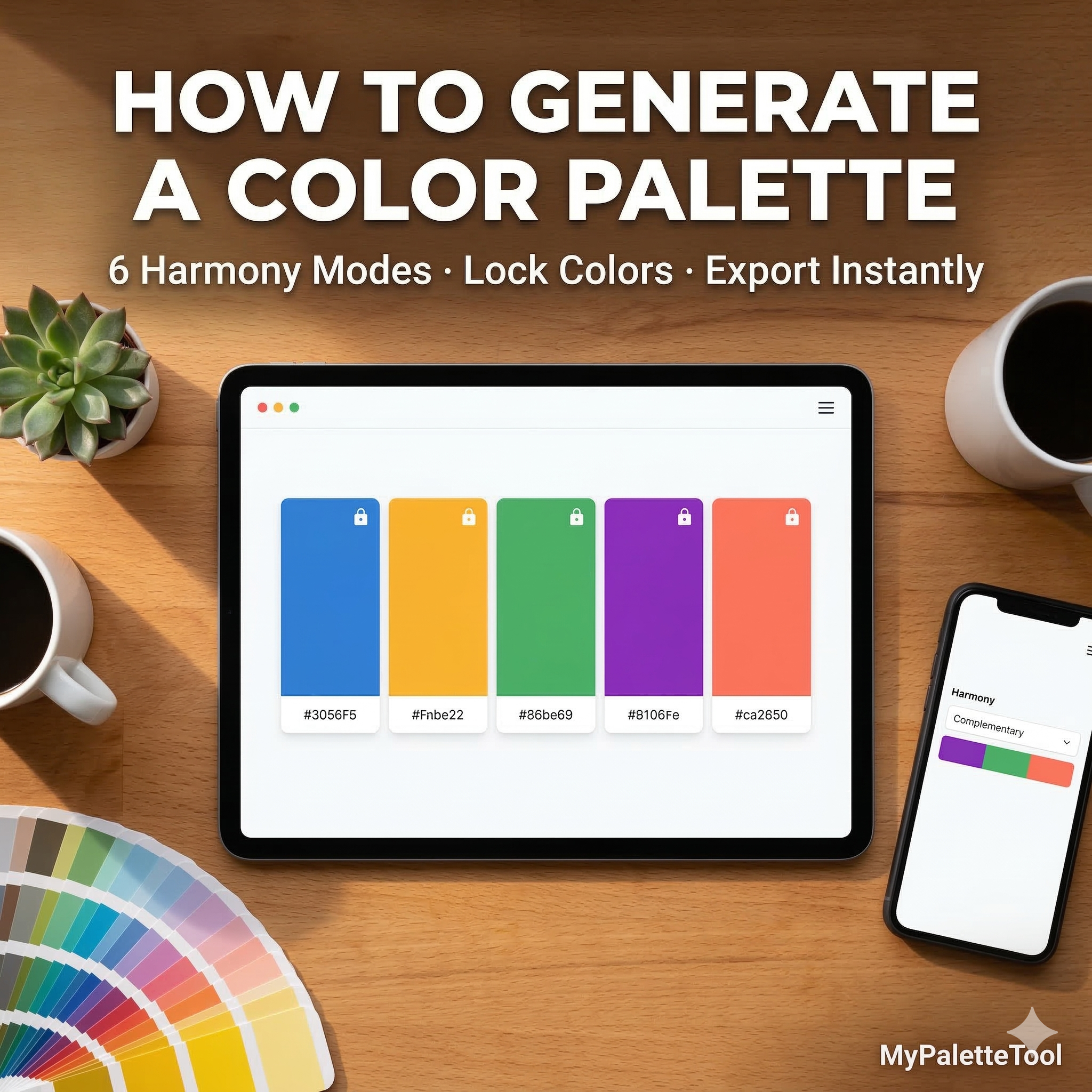
Step-by-Step: Using the MyPaletteTool Generator
Step 1: Open the Tool
Go to MyPaletteTool — no signup, no download, completely free.
Step 2: Choose a Harmony Type
Click the harmony dropdown and select your mode. If you're unsure, start with Complementary for bold designs or Analogous for subtle ones.
Step 3: Generate
Press spacebar or click "Generate" to create a new palette. Keep hitting it until something catches your eye.
Step 4: Lock Colors You Love
See a color you want to keep? Click the lock icon on that color. It stays fixed while the rest regenerates.
Step 5: Edit Manually (Optional)
Click any color to open the editor. Adjust hue, saturation, and lightness with precision sliders, or type in a specific hex code.
Step 6: Export
Click Export and choose your format:
- CSS — ready for any web project
- Tailwind — config-ready for Tailwind CSS
- SCSS — variables for Sass projects
- JSON — for design tokens or APIs
How to Pick the Right Starting Color
Your base color sets the tone for the entire palette. Here's a quick guide:
| Goal | Base Color | Why |
|---|---|---|
| Trust & professionalism | Blue (#1D4ED8) | Universal trust signal |
| Energy & urgency | Red (#DC2626) | Stimulates action |
| Growth & health | Green (#16A34A) | Nature association |
| Creativity | Purple (#7C3AED) | Premium, imaginative |
| Warmth & friendliness | Orange (#EA580C) | Approachable, energetic |
| Clean & minimal | Neutral Gray (#6B7280) | Versatile foundation |
Tips for Better Palettes
Apply the 60-30-10 Rule
- 60% — Dominant color (backgrounds, large areas)
- 30% — Secondary color (sections, cards)
- 10% — Accent color (buttons, links, highlights)
Always Include Neutrals
Pure color palettes are hard to use in real designs. Lock a near-white and a near-black to your palette before exporting. They'll handle text and backgrounds.
Practical neutral additions:
- Off-white: #F9FAFB
- Light gray: #E5E7EB
- Dark gray: #374151
- Near-black: #111827
Test on Real UI Elements
After generating a palette, mentally map colors to UI roles:
- Background → lightest color
- Text → darkest color
- Primary button → accent color
- Secondary button → muted version
If any assignment feels wrong, generate a new palette or adjust saturation.
Check Contrast Before Finalizing
A beautiful palette can fail accessibility if text/background contrast is insufficient. After generating your palette, run it through our Contrast Checker to verify WCAG compliance.
Minimum ratios:
- Normal text: 4.5:1 (WCAG AA)
- Large text: 3:1 (WCAG AA)
- UI components: 3:1 (WCAG AA)
Common Mistakes to Avoid
Too Many Saturated Colors
- Good: One or two saturated accents, rest muted or neutral
- Good: Lock the 3 you like, regenerate just the others
- Good: #111827 and #F9FAFB — softer on the eyes
- Generate a Complementary palette
- Lock your brand primary color
- Use complement for CTA buttons
- Add light neutrals for section backgrounds
Skipping the Lock Feature
Using Pure Black and White
Not Testing Dark Mode
If your product supports dark mode, test your palette in both contexts. A palette that looks great on white may not work on dark backgrounds.
Real-World Use Cases
Landing Page
Mobile App
- Generate a Monochromatic palette
- Use lightest shade for backgrounds
- Use mid shade for cards
- Use darkest shade for text
- Add one accent color for interactive elements
Dashboard UI
- Generate a Analogous palette
- Reserve one color for positive metrics (green)
- Reserve one for negative metrics (red)
- Use neutrals for 80% of the interface
Brand Identity
- Start with your brand value (see table above)
- Generate Triadic for a rich brand color system
- Lock primary brand color
- Export to JSON for design token pipeline
Exporting Your Palette
CSS Export
:root {
  --color-primary: #3B82F6;
  --color-secondary: #F59E0B;
  --color-accent: #10B981;
  --color-light: #EFF6FF;
  --color-dark: #1E3A8A;
}
Tailwind Export
// tailwind.config.js
module.exports = {
  theme: {
    extend: {
      colors: {
        primary: '#3B82F6',
        secondary: '#F59E0B',
        accent: '#10B981',
      }
    }
  }
}
SCSS Export
$color-primary: #3B82F6;
$color-secondary: #F59E0B;
$color-accent: #10B981;
$color-light: #EFF6FF;
$color-dark: #1E3A8A;
Conclusion
A color palette generator removes the hardest part of design — choosing colors that work together. With MyPaletteTool, you get six harmony modes, instant generation, color locking, and direct export to any format your workflow needs.
The best palette is the one you actually finish with. Stop overthinking color choices and start generating.
Ready to try it? Go to the Color Palette Generator — it's free, instant, and requires no signup.
Related Articles
Generate beautiful color palettes in seconds with MyPaletteTool — 100% free, no signup required.