How to Export Color Palettes to Tailwind CSS
Step-by-step guide to exporting custom color palettes into Tailwind CSS. Covers tailwind.config.js setup, Tailwind v4 CSS variables, shade scales, and building a semantic color system.
How to Export Color Palettes to Tailwind CSS
Tailwind CSS has become the dominant utility-first CSS framework — and for good reason. Its color system is powerful, but setting up custom brand colors can be confusing. This guide shows you how to generate a palette and export it directly to Tailwind format in seconds.
Why Tailwind's Color System Matters
Tailwind uses a structured color system with:
- Color names (
blue,gray,emerald) - Shade scales from
50(lightest) to950(darkest) - Semantic tokens for consistent usage across components
When you define custom colors in tailwind.config.js, every Tailwind utility class (bg-*, text-*, border-*, ring-*) becomes available for those colors automatically.
<!-- After configuring custom colors, these just work -->
<button class="bg-brand text-white hover:bg-brand-dark">
  Get Started
</button>
Generating Your Palette
Before exporting to Tailwind, you need a palette. Use our Color Palette Generator to create one:
- Open MyPaletteTool
- Choose a harmony type (Complementary, Analogous, etc.)
- Generate until you find a palette you love
- Lock the colors you want to keep
- Click Export → Tailwind
The tool outputs a tailwind.config.js-ready color object. Copy and paste — done.
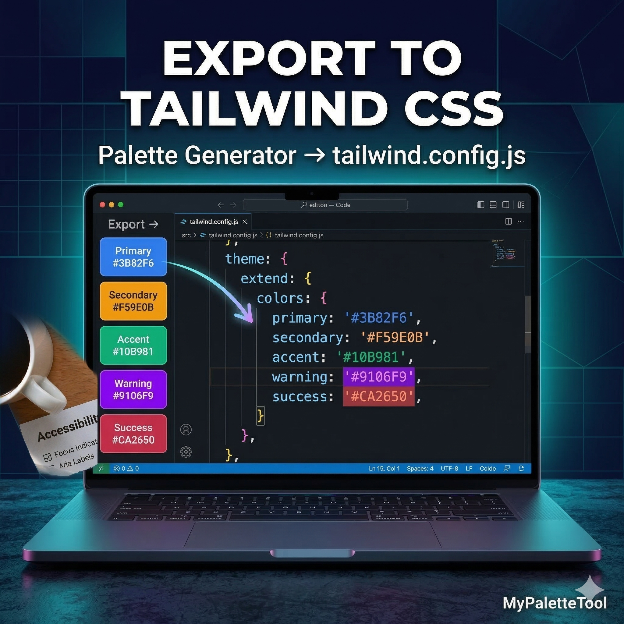
Understanding the Tailwind Export Format
When you export from MyPaletteTool, you get a structured object ready for Tailwind's theme.extend.colors:
// tailwind.config.js
module.exports = {
  theme: {
    extend: {
      colors: {
        primary: '#3B82F6',
        secondary: '#F59E0B',
        accent: '#10B981',
        light: '#EFF6FF',
        dark: '#1E3A8A',
      }
    }
  }
}
This adds bg-primary, text-primary, border-primary, and every other Tailwind color utility for each of your custom colors.
Two Integration Approaches
Approach 1: Simple Color Keys
Best for small projects or when you have 1–2 brand colors:
module.exports = {
  theme: {
    extend: {
      colors: {
        brand: '#3B82F6',
        'brand-light': '#93C5FD',
        'brand-dark': '#1D4ED8',
      }
    }
  }
}
Usage:
<div class="bg-brand text-white">Primary section</div>
<a class="text-brand hover:text-brand-dark">Link</a>
<div class="border border-brand-light">Card</div>
Approach 2: Full Shade Scale
Best for design systems or when you need multiple shades (like Tailwind's native colors):
module.exports = {
  theme: {
    extend: {
      colors: {
        brand: {
          50:  '#EFF6FF',
          100: '#DBEAFE',
          200: '#BFDBFE',
          300: '#93C5FD',
          400: '#60A5FA',
          500: '#3B82F6',  // base
          600: '#2563EB',
          700: '#1D4ED8',
          800: '#1E40AF',
          900: '#1E3A8A',
          950: '#172554',
        }
      }
    }
  }
}
Usage:
<div class="bg-brand-50">Soft background</div>
<h1 class="text-brand-900">Dark heading</h1>
<button class="bg-brand-500 hover:bg-brand-600">Button</button>
<div class="border border-brand-200">Card border</div>
How to generate a shade scale from a single hex:
- Open our Color Palette Generator
- Select Monochromatic harmony
- Enter your base color
- The 5-color output gives you shades from light to dark
- Export to Tailwind
For a full 11-shade scale (50–950), you can use the Color Converter to manually adjust lightness at regular intervals.
Step-by-Step: Full Workflow
Here's the complete workflow from palette to live Tailwind project:
1. Generate Your Palette
Open MyPaletteTool and generate a palette that fits your brand. For a typical project, aim for:
- 1 primary color — main brand color, used for buttons, links, accents
- 1 secondary color — supporting brand color
- 1 neutral scale — grays for text, backgrounds, borders
- 1–2 semantic colors — success (green), warning (yellow), error (red)
2. Export to Tailwind
Click Export → Tailwind. The output looks like:
{
  primary: '#3B82F6',
  secondary: '#F59E0B',
  accent: '#10B981',
  surface: '#F8FAFC',
  dark: '#0F172A',
}
3. Add to tailwind.config.js
/** @type {import('tailwindcss').Config} */
module.exports = {
  content: ['./src/**/*.{html,js,jsx,ts,tsx}'],
  theme: {
    extend: {
      colors: {
        primary: '#3B82F6',
        secondary: '#F59E0B',
        accent: '#10B981',
        surface: '#F8FAFC',
        dark: '#0F172A',
      }
    }
  },
  plugins: [],
}
4. Use in Components
<!-- Hero section -->
<section class="bg-surface">
  <h1 class="text-dark">Build something great</h1>
  <p class="text-dark/70">Subheading with opacity modifier</p>
  <button class="bg-primary text-white hover:bg-primary/90">
    Get started
  </button>
  <a class="text-secondary underline">Learn more</a>
</section>
5. Check Contrast
Before shipping, verify your text/background pairs with the Contrast Checker. Even well-generated palettes can have issues — especially for secondary and muted combinations.
Tailwind v4 Changes
Tailwind CSS v4 (released in 2025) introduces a CSS-first configuration. If you're on v4, colors are defined in CSS instead of tailwind.config.js:
/* app.css */
@import "tailwindcss";

@theme {
  --color-primary: #3B82F6;
  --color-secondary: #F59E0B;
  --color-accent: #10B981;
  --color-surface: #F8FAFC;
  --color-dark: #0F172A;
}
Usage in v4 is identical — bg-primary, text-secondary, etc. still work the same way.
Exporting for Tailwind v4:
When using MyPaletteTool's export, choose CSS Variables format instead of the Tailwind config format. The output will be:
:root {
  --color-primary: #3B82F6;
  --color-secondary: #F59E0B;
  --color-accent: #10B981;
}
Paste this inside your @theme {} block.
Building a Complete Design System
A production-grade Tailwind color system usually has three layers:
Layer 1: Raw Palette
// Raw colors — don't use directly in components
const palette = {
  blue: {
    500: '#3B82F6',
    600: '#2563EB',
    700: '#1D4ED8',
  },
  amber: {
    400: '#FBBF24',
    500: '#F59E0B',
  },
  // ...
}
Layer 2: Semantic Tokens
// Map raw palette to semantic roles
colors: {
  // Brand
  'brand':       palette.blue[500],
  'brand-hover': palette.blue[600],
  'brand-active':palette.blue[700],

  // Feedback
  'success': '#16A34A',
  'warning': '#D97706',
  'error':   '#DC2626',
  'info':    palette.blue[500],

  // Surface
  'surface':       '#FFFFFF',
  'surface-raised':'#F9FAFB',
  'surface-sunken':'#F3F4F6',

  // Text
  'text-primary':   '#111827',
  'text-secondary': '#6B7280',
  'text-disabled':  '#9CA3AF',
}
Layer 3: Component Usage
<!-- Developers use semantic tokens, not raw colors -->
<button class="bg-brand hover:bg-brand-hover text-white">Submit</button>
<p class="text-text-secondary">Helper text</p>
<div class="bg-surface-raised border border-gray-200">Card</div>
This approach means changing your brand color is a single edit — update brand in the config, and every component in the app updates automatically.
Common Mistakes
Overriding Tailwind's Default Colors
Using theme.colors instead of theme.extend.colors removes all of Tailwind's built-in colors. Use extend unless you explicitly want to replace them.
// ❌ Removes all default Tailwind colors
theme: {
  colors: {
    brand: '#3B82F6',
  }
}

// ✅ Adds to default colors
theme: {
  extend: {
    colors: {
      brand: '#3B82F6',
    }
  }
}
Skipping Dark Mode
If your app supports dark mode, define both light and dark variants:
colors: {
  surface: {
    DEFAULT: '#FFFFFF',
    dark: '#0F172A',
  },
  'text-primary': {
    DEFAULT: '#111827',
    dark: '#F9FAFB',
  }
}
<div class="bg-surface dark:bg-surface-dark text-text-primary dark:text-text-primary-dark">
Or use CSS variables for a cleaner approach:
:root {
  --color-surface: #FFFFFF;
  --color-text: #111827;
}

[data-theme="dark"] {
  --color-surface: #0F172A;
  --color-text: #F9FAFB;
}
Not Purging Unused Colors
Tailwind's content configuration ensures only used classes are included in your build. Make sure your content array covers all template files:
content: [
  './src/**/*.{html,js,jsx,ts,tsx,vue}',
  './components/**/*.{html,js,jsx,ts,tsx}',
]
Quick Reference: Export Formats
| Format | Use When |
|---|---|
| Tailwind config (v3) | Using tailwind.config.js |
CSS Variables / @theme (v4) |
Using Tailwind v4 |
CSS :root variables |
Using CSS custom properties without Tailwind |
| SCSS variables | Using Sass/SCSS workflow |
| JSON | Design token pipeline (Figma tokens, Style Dictionary) |
MyPaletteTool exports all of these formats — pick the one that fits your stack.
Conclusion
Exporting your color palette to Tailwind CSS closes the gap between design and code. With MyPaletteTool, the workflow is:
- Generate your palette at MyPaletteTool
- Click Export → Tailwind
- Paste into your config
- Use the color utility classes everywhere
No manual hex copying, no typos, no mismatched values between design and implementation.
Start with your palette → Color Palette Generator
Related Articles
Export your color palette to Tailwind CSS in one click with MyPaletteTool — free, instant, no signup.